You may have noticed that Bitcoin.com is looking a little different. We’re excited to unveil our new look after six months of hard work. Our domain has a long history, and as a company we’ve grown a great deal. After consideration of the crypto future ahead of us all, we decided to reshape Bitcoin.com’s design to present a greater image of things to come.
Also read: How to Exchange Your Amazon Gift Cards for Bitcoin Cash
Bitcoin.com’s Revamped Design Is Here
Operating the domain Bitcoin.com has been a wonderful experience and we’re pleased to give our visitors the very best services when it comes to the growing crypto industry. Bitcoin.com is a very unique website and most people don’t know but the domain was registered in January 2008, a whole year before Satoshi unleashed his invention on the world.
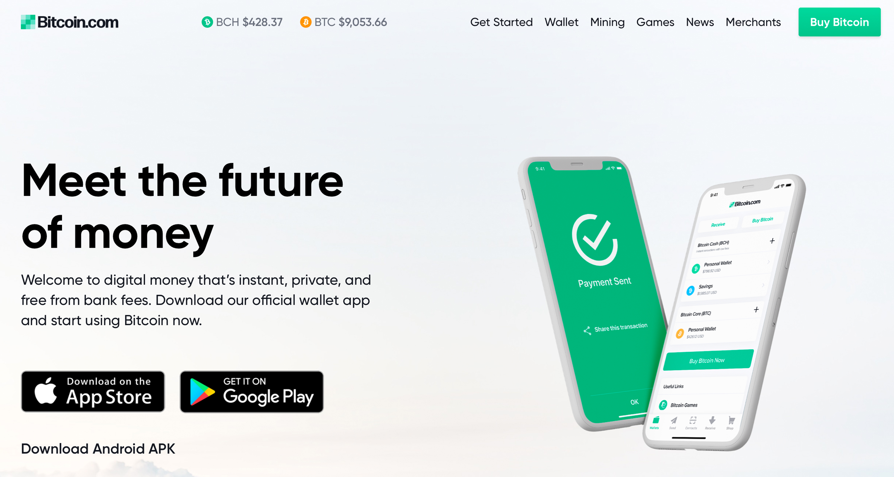
Since then, Bitcoin’s first angel investor, Roger Ver, took over the website in 2014 after it passed through many hands. Ver began to mold the web portal into a site that offers educational resources, news, and unique tools that help people use bitcoin. When we first created the Bitcoin.com brand, our website was much simpler. Over time, however, we added a plethora of tools, services, and resources that provide our visitors with everything they need to jump into the crypto ecosystem. In order to match the consistency of the powerful resources Bitcoin.com offers, we refined our design with a new logo, colors, and themes.

You will probably notice our logo is missing the Bitcoin symbol. When redesigning the website, we decided it was best to distinguish Bitcoin.com from the various Bitcoin cryptocurrency networks out there today. The intention of the new logo is to prevent users from any potential confusion from the domain name mixed with the old logo. Moreover, after five years and the craziness of 2017, we felt it was time to update our appearance and express ourselves as a company that fosters innovation. You will notice that the new color scheme is more contemporary and reflective of the evolving industry we’re in. Every section of the website has been revamped to highlight our services such as the Bitcoin.com Wallet, Local.Bitcoin.com, cloud mining, Markets.Bitcoin.com, daily news, Buy.Bitcoin.com, bitcoin cash games, BCH developer SDKs, and our block explorer.

With our growing number of bitcoin cash resources, tools, and services it made sense for our branding to change too. During the design launch, Bitcoin.com CEO Roger Ver stated:
The rebrand is a bold new chapter for Bitcoin.com. It’s an invitation to everyone out there: let our products show you how economic freedom can empower you.
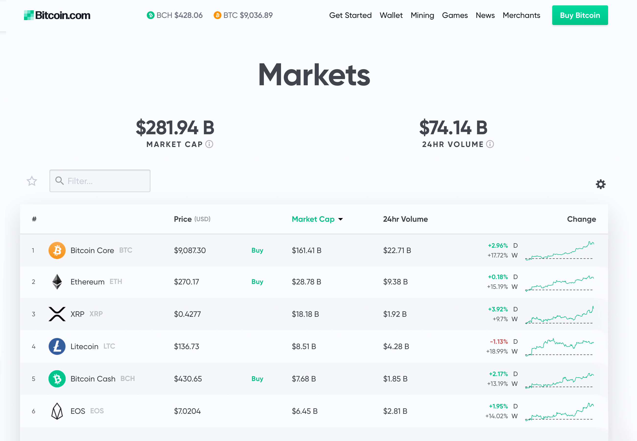
Improving the Overall Visual Experience of Bitcoin.com
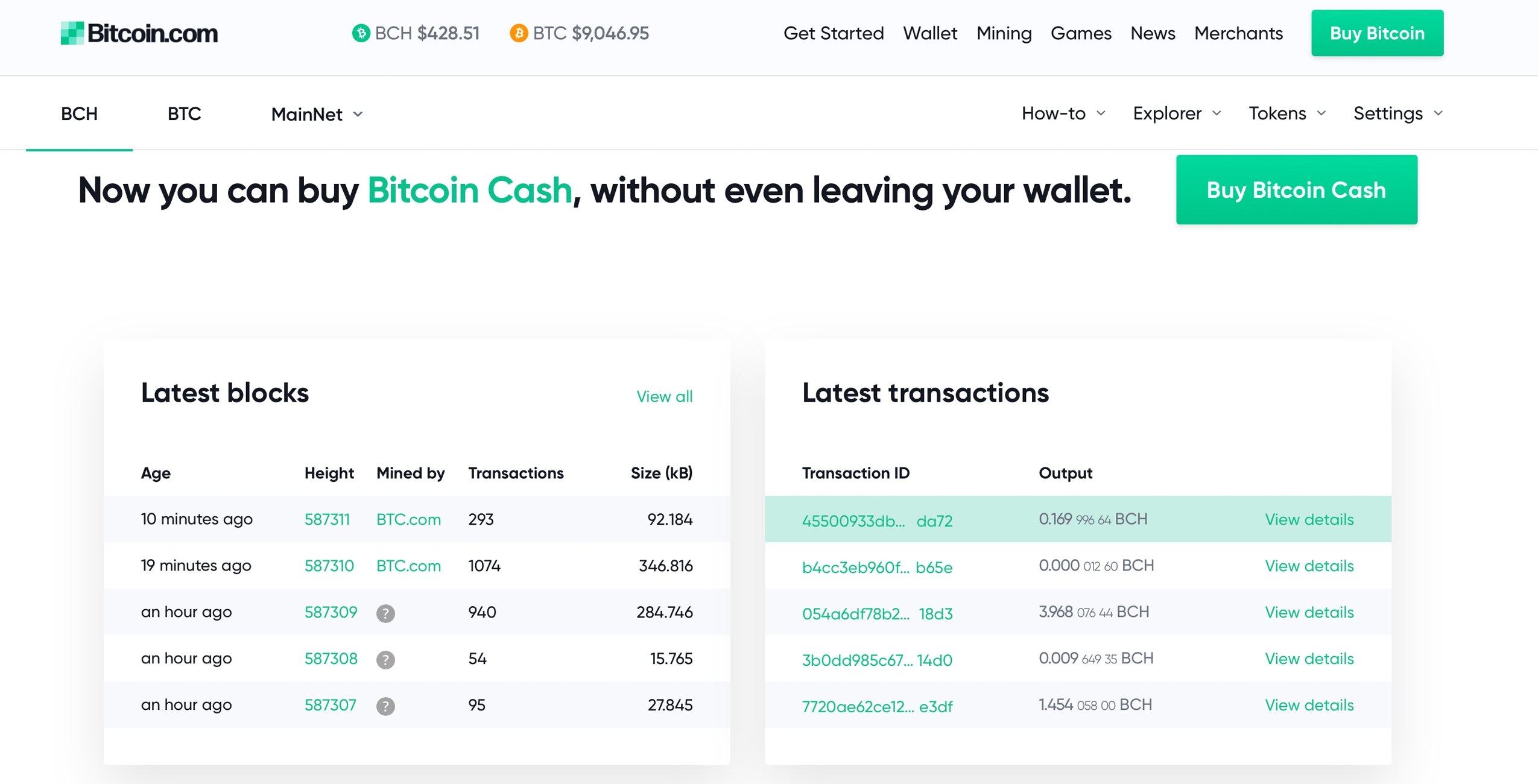
For months we’ve tirelessly worked on our brand and website design in order to present a cohesive visual interpretation of our company and its crypto evolution. Today, we’re thrilled to unveil our new brand and show off all the hard work we’ve put into every facet of the web portal. When you visit our landing page you will see the fresh new look accompanied with great resources on getting started with bitcoin basics.
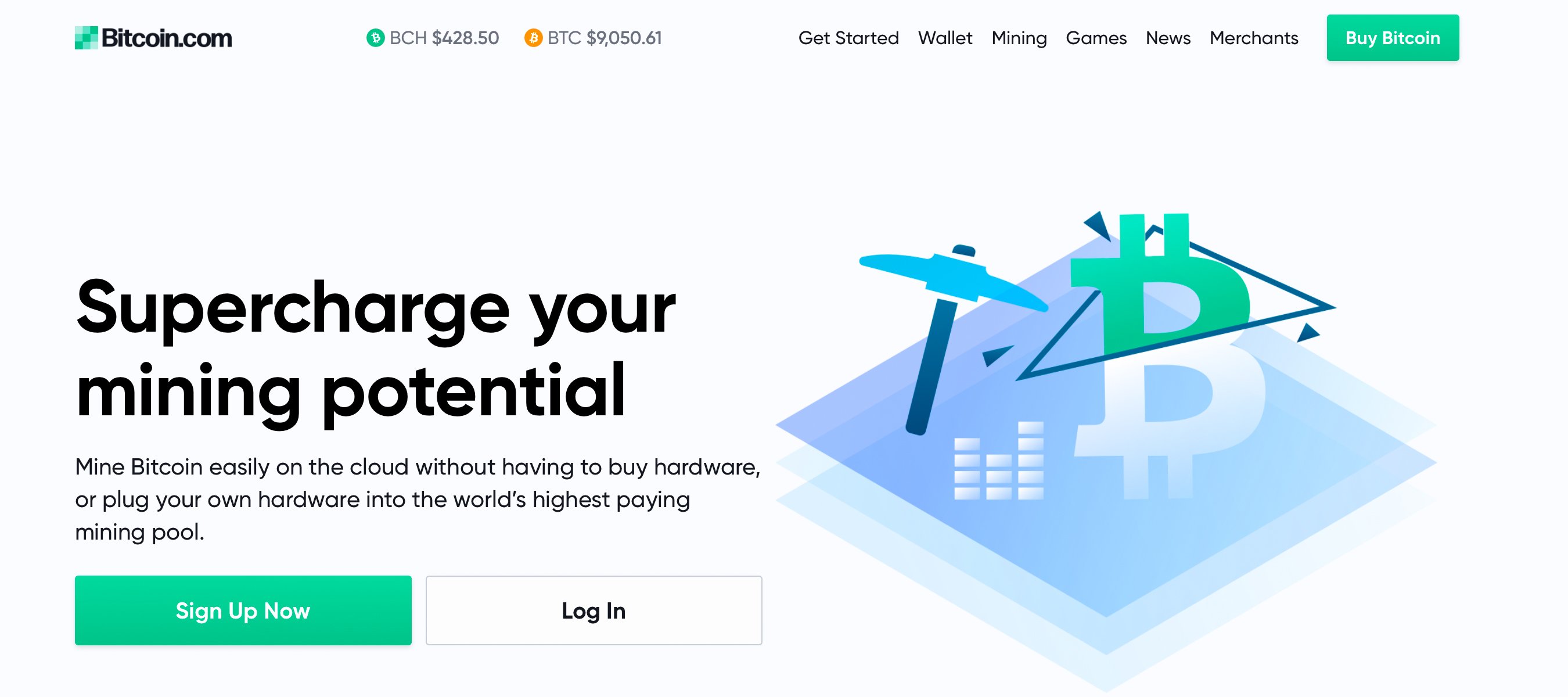
The homepage also includes guides on learning how to accept borderless BCH payments, access to our local BCH marketplace, a merchant directory so you can spend BCH online and in-store, and learn to mine bitcoin without technical knowledge or owning machinery. The new design gives us a better visual identity so we can continue to provide awesome looking charts, crypto market valuations, the latest news stories, podcasts, and videos.
“Bitcoin is designed to be usable and accessible for all — Our new color palette, in addition to our products and tools, reflects that principle,” Bitcoin.com Head of Design Andrew Todd remarked during the launch. “Reimagining our brand, we took a step back and identified our values. With universal accessibility being our most important value, we set out to create a color palette that would not only resonate with people and help create a lasting identity, but would work seamlessly across devices, in different environments, and for people with visual impairments.” Todd continued:
Our new logo also exemplifies accessibility. It consists of a bold and legible ‘Bitcoin.com’ logotype paired with a clean grid of blocks, which is representative of the intended scalable nature of Bitcoin blocks themselves. Color-wise, we have the brightest green moving in an upward-right trajectory, showing constant growth — This is finished by tight kerning of the Bitcoin.com lettering, reinforcing the solidity of our brand.

It was important for us to update our brand to make it easier for you, the visitor, and we think the new design improves the overall experience and usability of the site. While the aesthetics of the brand were a large factor, we are still molding Bitcoin.com to be the perfect place to gain information and resources on all things Bitcoin-related. We plan to continue to adding to the features of our web portal and we think the new style fits perfectly with the bright future ahead. So if you are just noticing the new changes, take a look around and explore Bitcoin.com in a whole new light.
What do you think about Bitcoin.com’s revamped brand and image? Let us know what you think about this subject in the comments section below.
Image credits: Bitcoin.com
Want to create your own secure cold storage paper wallet? Check our tools section. You can also enjoy the easiest way to buy Bitcoin online with us. Download your free Bitcoin wallet and head to our Purchase Bitcoin page where you can buy BCH and BTC securely.
The post Bitcoin.com Just Rebranded – Check out Our New Look appeared first on Bitcoin News.

Bitcoin.com is author of this content, TheBitcoinNews.com is is not responsible for the content of external sites.
Our Social Networks: Facebook Instagram Pinterest Reddit Telegram Twitter Youtube
